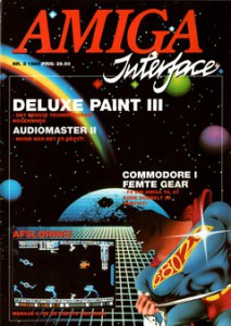
 Amiga Interface Issue 3 is added. 60 Colourful pages all in Danish 🙂
The magazine has gone through OCR, so it’s searchable.
While Adobe does OCR it also compress the images, Making this magazine much smaller ca 60megs compared to the original non OCR’ed which is at 289megs.
I’d like a comment on the quality if it’s still good or not.

Sorry, but where are the link for the magazine?
The magazines can be aquired from the menu – Magazine – Danish – Amiga Interface 🙂
Super, det havde jeg ikke lige gennemskuet!
Bladet ser rigtig fint og læseligt ud. Kontrasten på fotos og billeder undervejs ser ud til at være ret høj (f.eks. manden bag Deluxe Paint s.16 – men nu har jeg ikke originalen, så ved ikke helt hvordan det oprindeligt så ud), men ellers er det lækkert!
Some would probably notice a shift to Danish… 😉
There is a high contrast, or better yet.. clean up.
The colours are more colourful than the faded result a regular scan. The high contrast is a product of me fixing/cleaning all pages to a state where yellowness, shadows from the scanner etc are removed. Bringin the pages back to a near state of the original.
I can make a checkup on the original later today.
Tbh I don’t check all the pages, but I do make a check from time to time to compare against the original.
I just checked page 16, and there is little difference in the contrast. But you are right, compared to the monitor, the magazine paper is a little less contrasted.
Yeah, but it will be quite time consuming to give all the photos and screenshots in the magazine special treatment. As it is now it’s nice and the text is readable!
It is good work to give these old magazines some love with the scanner 😉
I quite agree, from a preservation/historical point of view the magazines contain quite a lot of information. It’s also to honor the writers and publishers.